
Have you ever walked into a room and felt a wave of calm or an exciting burst of energy? Colors are more than just pretty splashes on a wall, they actually shape how we feel every day. A flash of red can spark a sense of adventure, while a cool blue brings a cozy, gentle comfort. In this article, I’m excited to share how blending different hues can completely change a room’s vibe and even boost your mood. Let’s discover the magic of color psychology in spaces that work as hard as you do.
Applying Color Psychology for Stylish, Mood-Enhancing Interiors
Choosing the right colors can truly change the vibe of any room. Designers say every color carries its own mood that builds a space’s personality. Picture walking into a room painted red, it instantly fills you with energy. In fact, some restaurants use a bold red accent wall to boost energy and even spark your appetite.
Red shouts passion and power, making it perfect for spaces that need a burst of excitement. And blue, on the other hand, feels like a soft hug. It brings calm and clarity, ideal for spots where you want to relax and let the world slow down a bit.
Green offers a refreshing reset, much like a stroll through a sunny park in spring. It symbolizes renewal and balance, giving offices or living rooms a touch of nature’s peaceful vibe that helps you stay focused.
Warm shades like yellow and orange make kitchens and gathering spots feel extra friendly and lively. By mixing soft tints and deeper shades, designers guide your eye and create a natural flow that sparks creativity and a subtle thrill.
At the end of the day, picking the perfect colors isn’t just about beauty. It’s about tuning in to how different hues make you feel, whether you need comfort, a kick of energy, or a moment of peaceful reflection. Every thoughtful color choice turns a room into a space that feels stylish and in tune with your mood.
Color Psychology of Key Hues in Stylish Spaces
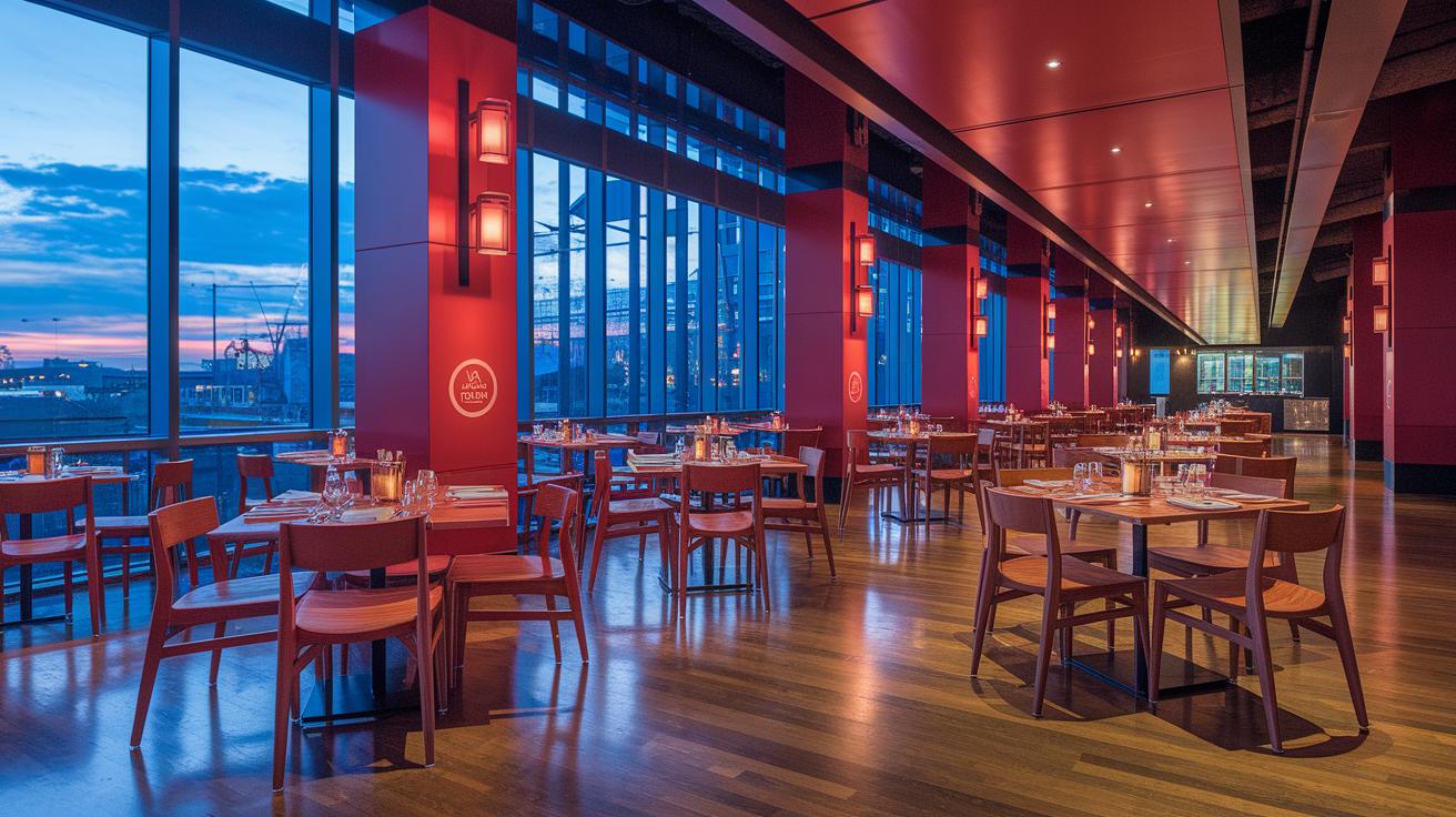
Red is all about energy and passion. It fills your dining spot with life, almost like a lively burst that uplifts your mood. Imagine a splash of red in a trendy eatery that instantly makes you smile.
Green brings a soft reminder of nature’s calm and renewal. It refreshes a space in a gentle, straightforward way. Picture a light green detail in a creative studio that invites a deep, soothing breath of fresh air.
Blue offers a much-needed break from the hustle and bustle. It wraps a room in calm clarity, making it a perfect spot to unwind. Imagine a cozy reading nook with a soft blue wall that whispers peace and tranquility.
Purple adds an intriguing twist by mixing luxury with creativity. It sparks fresh ideas and deep thinking, whether it's a bold violet encouraging artistic flair or a pale lavender bringing a touch of quiet sophistication. Think about a modern office where a purple accent wall inspires out-of-the-box thoughts.
White does more than look clean and simple. Its bright shine makes a room feel larger and more focused, turning everyday spaces into serene, clear backdrops that let everything else stand out. Envision an airy white lounge where every detail pops and calm fills the air.
Crafting Harmonious Palettes with Color Theory in Stylish Spaces
Color theory uses a simple idea, a color wheel, to group different hues so you can easily pick beautiful combos that brighten up any room. And here’s a fun fact: pairing colors like blue and orange makes your eyes light up, with both colors working together in an exciting way. This method helps you design spaces that are both dramatic and nicely balanced.
Complementary colors, like blue and its opposite orange, bring a crisp contrast that makes key features really pop. On the flip side, when you use analogous schemes, such as blue paired with blue-green and green, the colors blend together into a calming, harmonious scene. Think about a cozy lounge decorated in various tints of a single color; the result is a gentle, unified flow. And if you’re feeling bold, a triadic mix like red, yellow, and blue creates a striking, yet balanced, look that’s perfect for modern, creative spaces.
Take a quick look at this table for a clear summary of these color schemes:
| Scheme Type | Effect | Example Combination |
|---|---|---|
| Complementary | Crisp contrast that makes features pop | Blue and Orange |
| Analogous | Soft, natural harmony | Blue, Blue-Green, Green |
| Monochromatic | Unified, soothing rhythm | Different shades of one hue |
| Triadic | Bold yet balanced energy | Red, Yellow, Blue |
Give these color combos a try, and watch your space come alive with a vibrant, dynamic balance.
Practical Color Mixing and Accent Strategies for Stylish Spaces
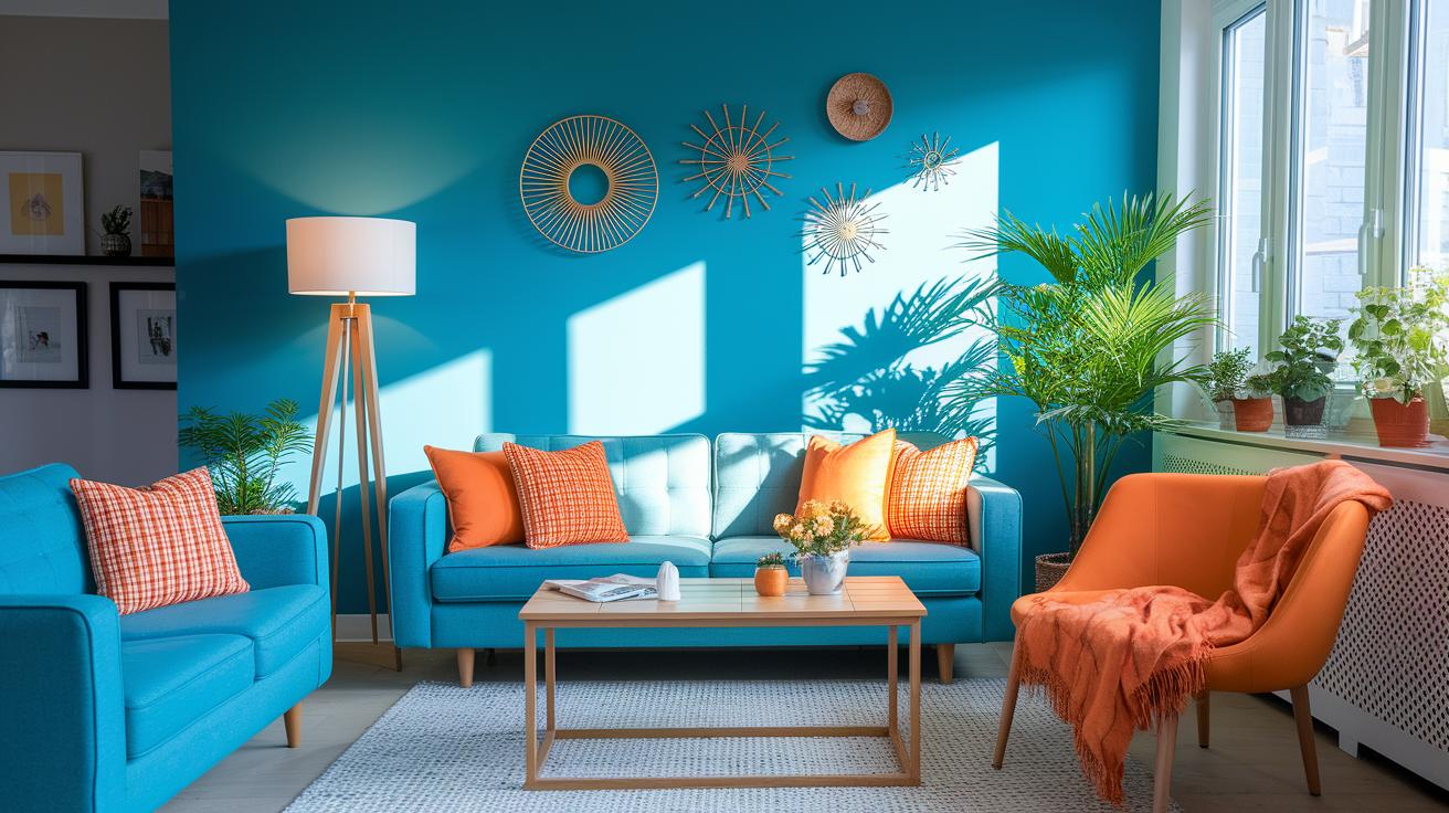
Start by blending colors to create a bright contrast that adds life to your space. Imagine a room where a cool blue wall meets splashes of bright orange on cushions and decor, it's playful and immediately draws your eyes. This mix not only catches your attention but also guides you through the room, highlighting its best features.
A smart mix of wall color, furniture, and little details can really boost your interior's vibe. Consider an accent wall for extra flair; you could even explore creative accent wall ideas for stylish living spaces (you know, fun ways to make your room stand out). It’s super helpful to test paint samples under different lights because a color can look entirely different in the sunshine compared to a cozy evening glow.
Here are some easy step-by-step tips for mixing accent colors:
- Try pairing complementary colors to make everything pop.
- Layer different shades of one color for a deeper look.
- Use an accent wall to draw focus to a special feature.
- Mix warm and cool tones to keep things interesting.
- Always check how the colors look under various light conditions before you decide.
Following these friendly tips helps you design spaces that look effortlessly stylish and full of creative energy. Enjoy the process, and let your personal style shine through every vibrant mix!
Room-by-Room Guide to Color Psychology in Stylish Spaces
Living Room
Imagine stepping into a living room with a soft, warm neutral backdrop that invites cozy gatherings. Add in bursts of energy with accents like a mellow ochre or a deep emerald-green. Picture the subtle glow of golden hints blending with a refined base, making it the perfect spot to relax with friends or family.
Bedroom
Think of your bedroom as your personal retreat where cool, calming shades like soft blue or gentle lavender set the mood for rest. Visualize walls washed in a serene blue that eases your mind after a busy day. These tranquil tones create a safe haven, a space where you can unwind and refresh yourself.
Kitchen
In the kitchen, bring in the cheer with warm yellows and oranges that tempts the appetite and lifts the mood. Balance these lively colors with touches of cool green to keep everything feeling fresh. Imagine a kitchen where a sunny yellow countertop meets a calm green backsplash, creating a lively yet soothing environment to whip up your favorite meal.
Bathroom
For a bathroom that feels like a mini oasis, opt for pale neutrals or soft greens that suggest cleanliness and calm. A light, airy palette brightens up the room and turns your daily routine into a little escape. Think of transforming your bathroom into a serene retreat with gentle hues that relax the senses.
Home Office
Set up a home office designed for focus and creativity by choosing clear blues or greens that support concentration. A splash of citrus or a hint of vibrant coral can spark creative ideas while keeping the vibe cool and organized. Picture a workspace that not only works hard but also feels stylish and inspiring, where every color nudges you toward a fresh burst of productivity.
Enhancing Stylish Spaces with Artful Color Placement and Light
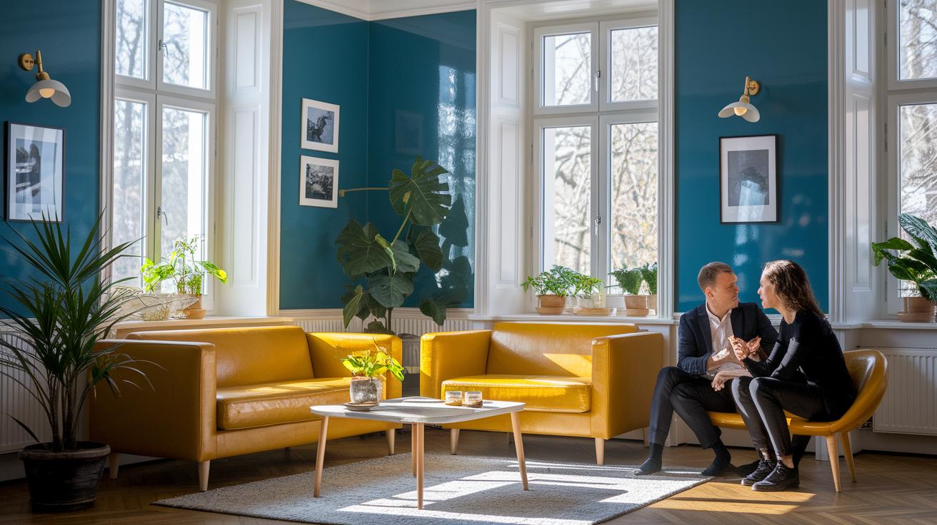
Lighting, texture, and color all team up to turn any room into a stylish, mood-boosting haven. Imagine natural sunlight or soft, ambient light changing a cool blue into an extra calm space, or making a bold red look brilliantly vibrant. It’s a smart idea to test your color choices at different times of the day, see how they play out from the bright morning light to the cozy glow of evening.
Try mixing finishes too. A shiny surface might make a cheerful yellow pop in the morning, while a matte finish lends a gentle, relaxed feel at night. Layering different textures like this creates a sense of balance that feels both personal and inviting. Picture a comfy seating area where light and deep shades blend together, crafting a space that’s warm and welcoming. Every little play of light and color adds a special touch to your overall design.
Case Study: Stylish Interior Transformed by Color Psychology
Imagine stepping into a children's playroom that bursts with energy and fun. The walls come alive with bold red, sunny yellow, and cool blue, each color chosen to create a lively atmosphere. Red sparks excitement, yellow brings a cheerful glow, and blue keeps the room grounded.
So, along with the vibrant walls, soft pastel furnishings gently calm the space. Picture plush seating in smooth, light tones that invite you to relax. One corner overflows with playful details and interactive toys, while another, with its quiet pastel touches, offers a cozy spot for reading or a little chit-chat.
This creative design turns an everyday playroom into a joyful haven. The mix of energetic and serene spaces shows how each color can share its own unique story, making room for both spirited play and calming moments in daily life.
Final Words
In the action, you learned how careful color choices set the mood and bring every room to life. We broke down the impact of key hues and showed how smart pairing and accent techniques create balance. Each tip, from mixing tones to placing light, proves practical advice helps transform spaces. With vibrant examples and real-world ideas, the post reaffirms that using color psychology in designing stylish spaces is a game changer. Embrace these insights and enjoy an empowered, inspired home decor update!
FAQ
What does the psychology of colors in interior design PDF explain?
The PDF explains how different hues impact mood and space energy by detailing practical techniques for mixing colors. It serves as a handy guide that links color choices to emotional and environmental responses in interiors.
How does the psychology of color in interior design PPT benefit designers?
The PPT breaks down color meanings and pairing ideas with clear visuals. It guides you in selecting hues that add balance and style, making your design projects both chic and mood-enhancing.
What can I learn from a color theory interior design book?
The book presents core color principles, explains the use of the color wheel, and offers ideas on creating harmonious palettes. It provides practical advice to help you mix shades for a stylish, mood-enhancing space.
How does an interior design colour palette generator assist in design decisions?
The palette generator suggests dynamic color combinations based on proven color theory. It inspires fresh pairings and saves time by offering ideas that suit your chosen mood, style, and space functionality.
How can you use colour in interior design effectively?
Using color effectively means balancing dominant shades with accent tones and testing swatches in real lighting. This strategy creates spaces that feel both energetic and cozy while highlighting key design features.
What does pink colour psychology in interior design imply?
Pink colour psychology implies warmth and gentle energy. Soft pinks create a calming, nurturing vibe, while bolder tones add a modern, lively touch perfect for bright, inviting interiors.
Why is colour important in interior design?
Colour plays a crucial role by setting the mood, influencing perception, and highlighting architectural features. Thoughtful color choices add both style and emotional depth, making each space feel uniquely inviting.
How do different colour schemes impact interior design?
Different schemes set distinct moods; complementary palettes create contrast, analogous arrangements yield harmony, and monochromatic designs offer unity. Each approach helps you tailor the space’s energy and style to fit your vision.
