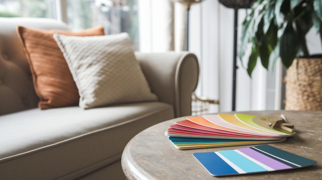
Ever notice how the colors in a room can make you feel instantly welcome or a little uneasy? Picking the right palette is just like choosing the perfect outfit, it ties everything together and sets just the right mood. In this guide, we'll walk you through simple steps to mix and match colors that make your space stylish and inviting. Plus, you'll see how each choice can turn your home into a calm retreat or a lively hangout, all by finding that perfect balance.
Essential Principles for Choosing Stylish Interior Color Schemes
Selecting the perfect palette is key to giving your space that chic vibe. Every decision, from the wall color to that cozy cushion, sets the mood and harmony of your room. It’s like piecing together an outfit where every element complements the other. Ever notice how a soft blush mixed with warm grays can turn your room into a calm retreat, almost like adding a hint of lavender to your morning coffee for that extra cozy kick?
Remember, your color choices affect so much more than just the walls. They play with the lighting, enhance the textures of your textiles, and bring out the shine in your finishes. Warm colors can fill a room with energy and intimacy, much like the first rays of sun on a cool day. On the other hand, cool tones can create a spacious, serene feel, imagine a gentle blue that whispers of quiet, relaxing evenings. It’s like choosing a signature scent that ties your entire day together.
Before you settle on a palette, keep a few friendly steps in mind. First, think about the room's purpose, whether it’s a lively space for gatherings or a quiet haven for relaxation. Then, consider how different light conditions throughout the day can transform your chosen hues. Lastly, make sure your new colors flow well with your existing décor, just like picking the perfect accessory that completes your look.
Applying Color Theory: Color Wheel Strategies for Stylish Interiors
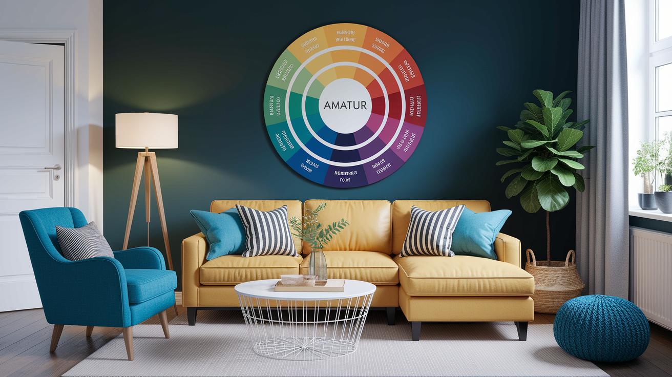
Color theory is like the secret ingredient to making a room look just right. When you get how colors mix and match, your space can feel both balanced and exciting. Think of the color wheel as your style roadmap, it shows you how different shades work together, much like choosing the perfect accessory to finish your outfit.
Let’s explore five easy ways to pick colors for your space:
- Primary: Imagine bold reds, blues, and yellows as the statement pieces that set a lively tone.
- Complementary: Choose colors that sit opposite each other on the wheel for a fun, high-energy pop, like a bright red paired with a cool green.
- Analogous: Pick colors next to each other on the wheel, such as soft blues and greens, for a smooth, flowing look.
- Triadic: Use three colors spaced evenly apart to add depth and a well-rounded vibe.
- Monochromatic: Stick with one color and mix different shades and tints to create a look that's both subtle and chic.
By playing with these color wheel ideas, you can design a home that not only looks amazing but also feels totally true to your personal style.
Using Color Psychology to Enhance Mood in Stylish Interiors
Recent research tells us that color choices in your home can really affect how you feel each day. Experts have found that our energy and calm are linked to the colors around us, blending modern ideas with timeless design.
Warm colors like red and orange can energize you and create a cozy vibe. Even a small hint of these colors in your workspace can keep you alert. Picture a little dash of red behind your desk that transforms a plain room into a burst of fresh, lively energy.
Cool tones, such as soft blues and greens, work wonders in lowering stress and making small spaces feel larger. These soothing colors invite a sense of calm and openness. Imagine a snug room painted in gentle turquoise with touches of serene green, like stepping into a refreshing, breezy retreat.
Mixing warm and cool shades gives your space a balanced, versatile feel. Today’s trends love combining the spark of lively hues with the tranquility of cool accents. Think of a living room decorated with amber lighting and cool mint details, the perfect blend that naturally shifts the mood as your day unfolds.
Step-by-Step Guide to Creating a Cohesive Palette for Stylish Interiors
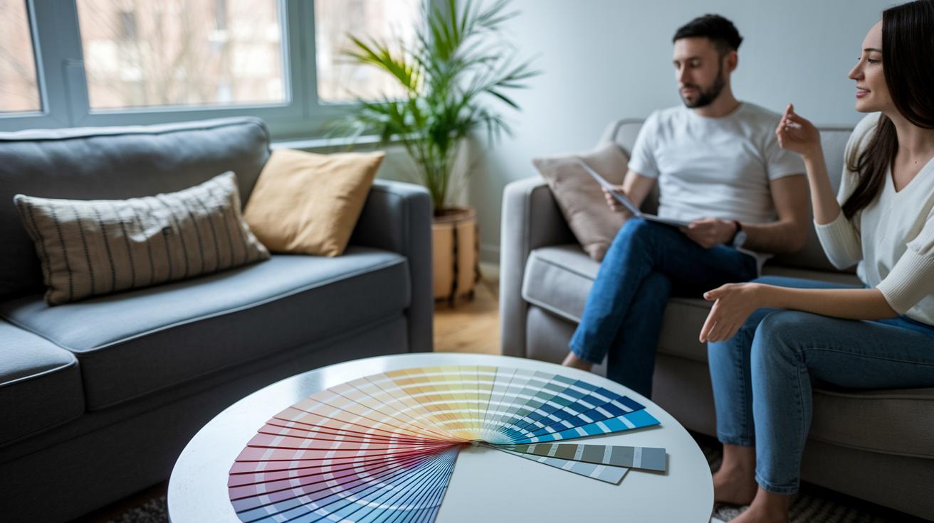
When you're designing a room, picking colors isn't just about choosing your favorites. It’s about blending every hue with the room’s purpose, lighting, décor, and your unique style. Let’s dive into this fun and creative process together.
- Know what the room is for – Whether it’s a lively space for friends or a calm retreat for relaxing, the room’s purpose will shape the mood you want to create.
- Play with color samples in different lights – Check out your colors at different times of the day. Morning sun, afternoon glow, or soft evening light can make a big difference.
- Think about how colors make you feel – Every shade has its own vibe. Warm tones can give you energy, while cool ones might help you unwind.
- Pin down your decorating style – Whether you’re into clean, modern looks or something cozier and rustic, pick colors that match your vibe for a room that feels just right.
- Consider the room’s size – Lighter colors can open up a small space, while deeper hues add warmth and depth to larger rooms.
- Match your new palette with your current furniture – Like pairing a perfect accessory with an outfit, ensure your colors work well with what you already have.
- Keep an eye on trends – Mixing classic choices with a touch of modern flair, like Pantone’s current color of the year, can give your room a fresh, stylish twist.
When you follow these steps, you create a thoughtful process that’s part art and part science. Each tip fits together like a puzzle, ensuring your final color scheme is as beautiful as it is balanced, a space that truly feels like home.
Selecting Accent Colors and Accent Walls for Stylish Interiors
When picking a bold color to highlight your space, think about how it contrasts with your main colors and matches your style. Your accent tone should pop against the background yet feel naturally tied to the overall look. For instance, if your walls are a soft, neutral shade, a lively, vivid color can brighten the room without overwhelming it. Picture that splash of color working in harmony with your furniture and textiles, much like a signature accessory completes your outfit.
Accent walls or carefully chosen décor pieces are a fun way to let your favorite color shine, even as the seasons change. They guide the eye to a special spot in the room, keeping everything balanced and inviting. If you're curious about making this work, check out tips on how to choose an accent wall to ensure it fits perfectly with your design goals. This approach not only freshens up your space but also gives you the chance to experiment with different moods throughout the year.
Case Studies: Chic Room Palette Inspiration from Modern Home Décor
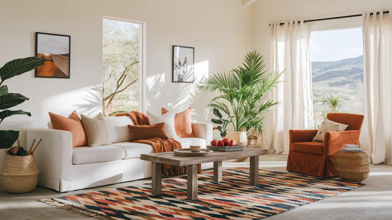
Desert Chic uses a soft white and ivory base brightened with warm hints of terra cotta, sienna, and cognac, all balanced with a touch of greenery for that light, breezy desert feel. Picture a room where gentle neutrals set the stage for bold, warm accents, like a standout rug that brings everything together. This look creates a cozy, inviting atmosphere that’s perfect for layering in natural textures or rustic accessories to boost the theme.
Rich Jewel Tones is all about contrast and lively pops of color. Start with a neutral backdrop acting as a blank canvas, then spice it up with bursts of canary yellow, sapphire blue, and aquamarine to form eye-catching focal points. Imagine a chic living area where a striking piece, like a bold rug or unique furniture, anchors the space and adds personality. This palette adapts beautifully to any room size, neutrals make small spaces feel open, while jewel tones bring drama to larger areas without overwhelming them. Feel free to swap out accent pieces now and then to keep your design feeling fresh and full of life.
Tools, Trends, and Resources for Visualizing Color Schemes in Stylish Interiors
Stay in the loop by checking out Pantone’s color of the year and top industry magazines, it's like reading your go-to fashion mag but for your home décor. Fun fact: Pantone’s choice has been setting the style tone for over ten years, guiding modern interiors with flair.
Try out paint apps that let you see new colors live on your walls. They show you how a hue can change in different lights, almost like magic unfolding right before your eyes.
Create your own digital mood board by mixing images and color samples until everything feels just right, much like putting together the perfect outfit. This creative step not only sparks fresh ideas but also keeps your design choices smooth and stylish.
Final Words
In the action, this guide broke down the art of picking a harmonious color palette that ties every element together. We explored how hues shape room moods and shared practical steps to make your space reflect both function and style. The case studies, accent color tips, and digital tool insights provided simple ways to bring your ideas to life. Remember, a personalized touch can brighten every corner. Keep experimenting with how to choose color schemes for stylish interiors for a space that feels beautifully you.
FAQ
Frequently Asked Questions
How to choose color schemes for stylish interiors on Reddit and for living rooms?
Choosing color schemes from Reddit or for living rooms means mixing community tips with practical design advice. Focus on the room’s mood, lighting, and balance to create a look that feels both personal and cohesive.
How to use digital tools like color palette generators, apps, PDFs, or websites for interior design?
Using digital tools lets you experiment with color combinations quickly. Whether it’s an app, PDF guide, or website, these tools help you visualize hues in real time and spark creative home design ideas.
How do popular color rules like the 3-5-7, 3 color, and 70/30 rules guide interior design choices?
These rules offer simple ratios for balanced color schemes. The 3-5-7 rule suggests a layered balance, the 3 color rule focuses on a trio of shades, and the 70/30 rule pairs a dominant base with a striking accent.
How do I pick the right color palette for interior design?
Picking the perfect palette involves considering the space’s purpose, light levels, and current décor. Trying out samples in different lights and creating mood boards can guide you toward a harmonious, stylish combination.